
No products in the cart.

Why Pencil Cap Colors Matter for Branding
- Mark Yang
- January 25, 2026
- 7:30 pm
- No Comments
Table of Contents
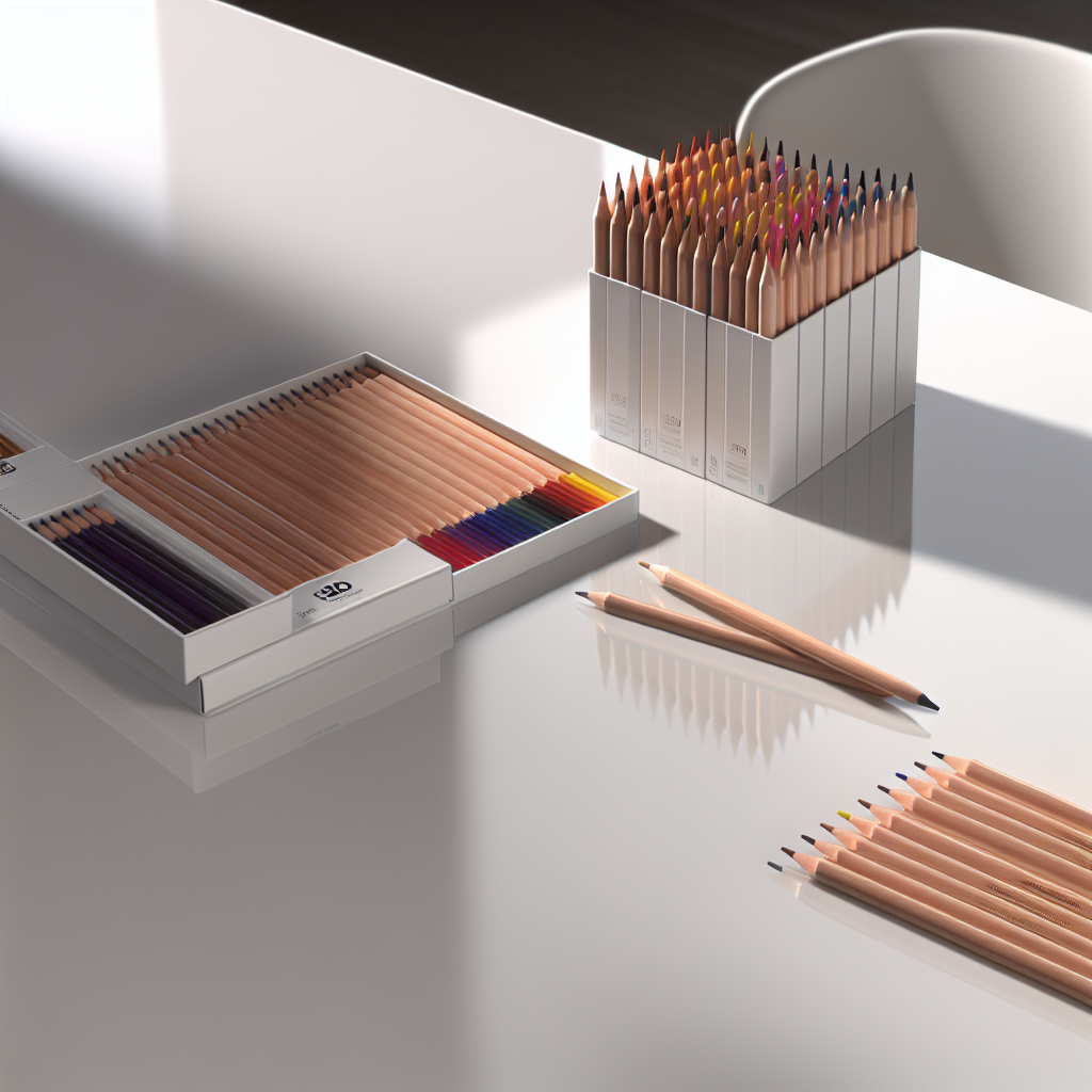
Walk into any office, classroom, or art studio, and you’ll likely find a pencil lying around — perhaps a classic yellow No. 2 or a sleek black carpenter’s pencil. But look more closely, and you’ll notice a small yet powerful detail: the color of the pencil cap. Often overlooked, pencil cap colors are far more than aesthetic choices. They play a vital role in branding, product recognition, and emotional association. In today’s competitive market, where even the smallest design decisions can influence consumer perception, understanding why pencil cap colors branding matters is crucial for manufacturers, marketers, and designers alike.
Why Pencil Cap Colors Are More Than Decoration
At first glance, the cap color on a pencil might seem like a trivial design element. After all, it’s just a dab of paint or plastic at the end of a wooden stick. But as with all visual design choices, color carries weight — psychologically, emotionally, and strategically.
According to color psychology studies in product branding, hues can trigger specific emotional responses. Blue evokes trust and calmness, red signals energy and urgency, green suggests harmony and nature, and black conveys sophistication. These associations are not accidental; they stem from cultural conditioning and visual memory. When applied to something as ubiquitous as a pencil, these colors can subconsciously shape how consumers feel about the brand behind it.
In the world of promotional merchandise, especially in stationery, color is often the first thing people notice. A bright red cap on a pencil might scream “bold and dynamic,” while a pastel mint green might whisper “creative and approachable.” These impressions form within seconds — and that’s where the branding opportunity lies.
The Pencil as a Branding Canvas
While pens have long been a staple of promotional products, pencils offer a unique tactile and visual experience. Their wooden texture, natural aesthetic, and eco-friendly perception make them ideal for brands that want to project authenticity and sustainability. But the pencil cap — often the only plastic or painted part — becomes the focal point for color-based branding.
As outlined in Musgrave Pencil Company’s guide to custom pencil design, choosing the right cap color is a key step in aligning the product with the brand’s identity. Whether you’re designing for a tech startup, a school district, or an eco-conscious nonprofit, the cap color can either reinforce or dilute your brand message.
| Cap Color | Common Associations | Ideal for Brands That Emphasize |
|---|---|---|
| Red | Energy, urgency, passion | Innovation, activism, sports |
| Blue | Trust, calm, stability | Finance, healthcare, education |
| Green | Eco-friendliness, growth, nature | Sustainability, wellness, agriculture |
| Black | Luxury, power, elegance | Design, fashion, premium services |
| Yellow | Optimism, creativity, warmth | Education, children’s products, art |
Color Psychology in Action: The Emotional Pull
In marketing, emotion is currency. A pencil with a carefully chosen cap color can evoke specific feelings, making the brand more memorable. Research from Pens.com shows that consumers are more likely to engage with, remember, and feel positively about promotional items that use colors aligned with their emotional expectations.
For example, a wellness brand distributing pencils with soft green caps subtly reinforces its message of balance and nature. A tech company using electric blue caps signals innovation and dependability. These aren’t coincidences — they’re deliberate choices rooted in consumer psychology.
In fact, the “Pigment Test” described by David Bain in The Pencil-Pen-Pigment Logo Test explores how visual elements like color can dramatically affect logo and product recall. Bain argues that a logo or brand color must leave a strong pigment impression — a mental stain, so to speak — to be effective. Pencil caps, being the most visible and customizable part of the pencil, are prime real estate for this pigment strategy.
Standing Out in a Sea of Sameness
In the crowded world of promotional products, standing out is half the battle. A pencil with a unique cap color can immediately differentiate itself from competitors on a trade show table or in a conference swag bag. According to PensXpress, bright and vivid colors like neon green, orange, or electric blue tend to attract more attention in crowded settings. These colors may not be suitable for every brand, but when used strategically, they can boost visibility and engagement.
Of course, the goal is not to be loud for the sake of attention but to be consistent with your brand’s tone and message. A law firm using neon pink caps might raise eyebrows — and not in a good way. But a youth-focused nonprofit could use that same color to express vibrancy and inclusivity.
Practical Considerations in Manufacturing
From a manufacturing perspective, cap color is one of the simplest yet most effective design customizations. During OEM (Original Equipment Manufacturer) production, cap color is typically applied through dip-coating, injection molding, or painting — all of which are scalable and cost-effective processes.
For brands working with pencil manufacturers, choosing cap colors early in the design process helps streamline production and avoid costly changes. It’s also an opportunity to ensure color consistency across product batches — a detail that matters for maintaining brand integrity. Color matching using Pantone codes or digital swatches ensures that the cap color aligns precisely with the brand’s visual guidelines.
Moreover, some cap materials — such as recycled plastic or biodegradable polymers — can further reinforce the brand’s values, especially for companies emphasizing sustainability. These materials can be tinted in brand-specific colors, combining eco-consciousness with visual branding.
Integrating Cap Colors Into a Holistic Brand Strategy
Cap color should never be an afterthought. Instead, it should be part of a larger visual identity system. As highlighted in the article “Click vs Cap Pens: Choosing the Right Pen for Your Brand Strategy”, every design decision — from form factor to color — contributes to the user experience and brand perception. The same applies to pencils. When the cap color aligns with the rest of the brand’s visual language, it creates a cohesive and professional appearance.
Consider how the cap color interacts with other elements: the body color, the imprint (logo or slogan), and even the eraser. A well-designed pencil is a miniature billboard — compact, functional, and brand-aligned. When all parts work together, the result is a product that not only writes but also tells a story.
Real-World Examples: Brands That Got It Right
Some of the most iconic pencil designs owe their recognition to smart use of cap color. Think of the classic Dixon Ticonderoga with its forest green and yellow cap — a color scheme that has become synonymous with school supplies in North America. Or the Blackwing 602 with its matte gray body and gold ferrule cap — a design that exudes vintage luxury and appeals to creatives and professionals alike.
These examples show how cap color, when used thoughtfully, becomes part of a brand’s DNA. It’s not just about looking good — it’s about being remembered.
Tips for Choosing the Right Pencil Cap Color
- Know your audience: Choose colors that resonate with your target demographic.
- Stay on brand: Align cap color with your existing brand palette and tone.
- Consider context: Will the pencil be used in schools, offices, or events? Adjust accordingly.
- Balance visibility and subtlety: Bright colors attract attention, but muted tones may better suit premium brands.
- Test before mass production: Always prototype and review under different lighting conditions.
Final Thoughts: Small Cap, Big Impact
In the realm of branding, every detail matters — especially the ones consumers see and touch every day. Pencil cap colors may seem minor, but in practice, they are powerful tools for emotional engagement, brand recognition, and product differentiation. Whether you’re a stationery manufacturer, a promotional marketer, or a brand manager, paying attention to this small but mighty design element can yield outsized returns.
So next time you pick up a pencil, take a moment to notice the cap. It’s not just a color — it’s a message, a memory, and a brand story waiting to be told.
Related Reading
- Understanding Pencil Eraser Color Variations
- Why Custom Branding Makes Retail Pencils Sell Better
- How Factories Ensure Batch-to-Batch Color Consistency
- How Factories Reduce Color Fading from UV Exposure
- Why Colored Pencils Need Higher Pigment Load for Artists
- Why Some Pencil Brands Use Matte Finishing
- How Factories Control Pencil Cap Adhesion Strength
- Understanding Pencil Barrel Diameter Tolerance
Share This Post
Share on facebook
Share on twitter
Share on linkedin
